By its nature, medical advertising must convey complex, often dry information to a highly-educated, discerning audience. It must be accurate and balanced – excess and exaggerations are not allowed – everything that’s said must be true. This high standard is one that only our industry must measure up to.

Regardless of these constraints, like all effective advertising, medical advertising demands creativity, and a glance at our history shows numerous examples of excellence – ads that stop the reader and communicate their message in an innovative and effective manner.

In 2014, the Medical Advertising Hall of Fame introduced a way to recognize and honor these ads and the teams that created them, the Heritage Ad Awards. Quite simply, these Awards honor the best of our craft – ads that are no longer being run that combine copy, graphics, and focus to create outstanding advertising.

Each MAHF member may nominate two ads each year, not necessarily ads that they created, but those they feel are outstanding examples of our profession. The full membership votes on the ads nominated, with the top two being given the Heritage Ad Award.

Heritage Award Winners

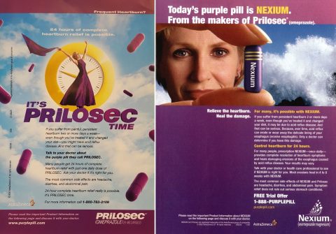
Prilosec

Prilosec & Nexium

Name of Company: AstraZeneca
Agency which created Ad: Saatchi & Saatchi Wellness
Creative/Account Team: Saatchi & Saatchi Wellness
Creative Rationale:

By the year 2000, AstraZeneca had the world’s best-selling pharmaceutical brand at more than $4 billion in sales with Prilosec, the blockbuster PPI for heartburn. But it had a dilemma with the upcoming launch of Nexium, a next generation PPI. How could they follow such a success?

The agency’s answer was “The Purple Pill” DTC campaign for Prilosec. Launched one year before the US launch of NEXIUM, “The Purple Pill” was an ingenious strategic idea to help transition consumer brand equity from the reigning champ to its successor, by focusing on transferrable brand elements such as the pill shape and color.

The campaign launched in all channels, including innovative outdoor buys at 13 major rail stations across the US called “station domination” or full takeovers. The result was that “The Purple pill” became a household phrase, one that was easily transferred to Nexium a year later, when it launched as “Today’s Purple pill.”

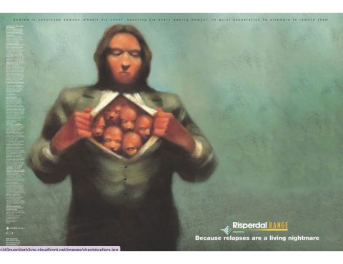
Heritage_Risperdal_Page_1

Risperdal

Name of Company: Janssen-Cilag Ltd.
Agency which created Ad: Junction 11, UK
Agency submitting: MERGE
Creative/Account Team: Illustrator: Mark Moran, Art Director: John Timney, Copywriter: Richard Rayment
Creative Rationale:

Approved in 1993 for the treatment of schizophrenia, Risperdal was the second atypical antipsychotic to enter the market. By 2004, clinicians had 6 atypicals to choose from, making differentiation difficult.

With the ‘Living Nightmare’ Campaign, UK-based Junction 11 captured the sinister nature of schizophrenia perfectly as an everyday battle patients face to deliver a strong efficacy claim focused on relapse prevention. The creative work not only set Risperdal apart in terms of its efficacy, but also demonstrated a deeper understanding of the disease it was indicated to treat.

Any awards and honors received:
Epica Awards 2004
Cresta Awards 2005
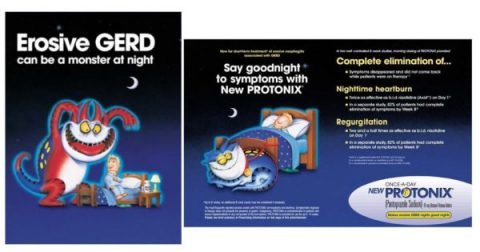
protonix-3

Protonix

Name of Company: Pfizer (formerly Wyeth)
Agency which created Ad: Havas Life (formerly Euro RSCG Life)
Agency submitting: Havas Health
Creative Rationale:

The PROTONIX GERDee campaign depicted a heartburn monster (heartburn is also known as GERD) that was a nightmare for Nighttime GERD patients. GERDee was one of the earlier illustrated campaigns that showed more light-hearted creative could be used to hit home on a tough disease state. The campaign illustrated the heartburn monster out of control (Red and fiery) before the patient takes PROTONIX, and GERDee returns to a cool, resting blue image. This campaign was used for the entire lifecyle of the brand from launch to patent expiration, which showed its campaignabilty and sustainability. It’s differentiation in a class of multiple PPIs was key to the brand’s billion dollar success. The campaign was rolled out across all channels, including tiny stuffed GERDee animals that became commonplace in Gastroenterologist’s offices.

Any awards and honors received:
PM 360 Ad of the Year
Other awards were 16 years ago and difficult to track down (it truly is a Heritage award)
Protonix was one of the fastest brands to ever reach $1 Billion.
Brand Team received award for Brand Team of The Year
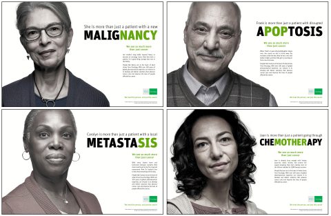
teva

TEVA Oncology Campaign

Name of Company: TEVA Pharmaceuticals
Agency which created Ad: AbelsonTaylor
Agency submitting: AbelsonTaylor
Creative Rationale:

By focusing on rare cancers, Teva’s commitment is rather unique—serving small cancer populations that don’t often make the headlines. With the ‘In A Word’ Campaign, AbelsonTaylor focused on Teva’s understanding of who their patient really is, what makes them more than just another script.

Many pharma companies say they’re in it for the patient. Not particularly unique or ownable. This campaign backed that position with true understanding and emotion to make it different and believable.

Any awards and honors received:
TEVA PM360 Trailblazers 2014 Gold – Unbranded campaign
TEVA Communicator Award 2015 TEVA Oncology Campaign: Film/Video – Employee Communications
TEVA Communicator Award 2015 TEVA Oncology Campaign: Film/Video – Pharmaceuticals
claritin

Claritin

Name of Company: Schering-Plough
Agency which created Ad: Thomas Ferguson Associates
Agency submitting: Ogilvy CommonHealth Worldwide
Creative Rationale:

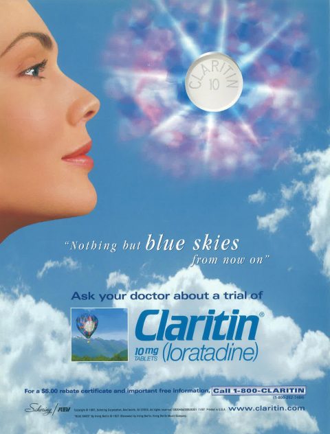
Four years post-launch, Claritin, and the 4 line extensions (Claritin D-12, Claritin D-24, Claritin Syrup and Claritin Redi-Tabs) were promotionally aligned under a single auspice: the “Nothing But Blue Skies…”campaign. The premise was no less than owning the air, clarity at all times, the limitlessness of the sky above. The blue sky graphics carried across all promotional materials, including the full range of DTC advertising. Literally millions of Blue Sky pharmacy bags were distributed to consumers, regardless of what prescription they were having filled.

Blue Sky iconography was so strong that no other brand would even consider an outdoor concept if it looked like they contained “too much” sky. When Claritin went OTC, the blue sky graphics went with it, and continues on all packaging to this day – as does the theme “Claritin Clear”, in which an impediment is removed, and a brilliant blue sky revealed.

At its peak, Claritin achieved over $4 billion dollars in annual sales.

Any awards and honors received:
We cannot find documentation of all the different honors awarded this campaign, but there were many, including Ad Age Brand of the Year.
The ad can also be found on page 216 of Medicine Avenue 2.
restylane-silk

Restylane® Silk

Name of Company: Galderma
Agency which created Ad: TBWA\WorldHealth, formerly Corbett Accel Healthcare Group (CAHG)
Agency submitting: TBWA\WorldHealth
Creative Rationale:

What makes this ad specialGalderma is the largest company in the world devoted exclusively to dermatology. In the area of aesthetic products, the company markets a line of injectable fillers under the Restylane name. Silk was a new formulation, very precise, for shaping lips and smoothing fine lines around the mouth. The challenge was to launch this brand to a professional target of US aesthetic dermatologists and drive rapid uptake.

Doctors who work in this category take great pride in not only their technical expertise as injectors, but also in their aesthetic sense and their conviction that what they do blends both science and art. We appeal to the artist in each doctor by drawing a comparison to famous artists who portrayed female beauty.

In execution, we sourced and negotiated rights to famous portraits by the contemporary painter Alberto Vargas, the renaissance artist Botticelli, and the 20th-century Polish artist Tamara de Lempicka. All captured female beauty in a distinctive style using characteristic tools. We compare the effects these artists achieved to the effects our target can achieve using Silk. Each historical image is matched by a present-day photo of a model styled like the painting; similar, but not identical. Each model was authentically injected with Silk prior to the shoot.

Through Q1 2015, sales of Silk ware at 200% of forecast.

Any awards and honors received:
2015 – IPA Best of Health – GOLD Apple – Best in Show – Healthcare Professional Ad Campaign
2015 – IPA Best of Health – SILVER – Best Use of Photography
2015 – IPA Best of Health – SILVER – Healthcare Professional Ad Campaign
2015 – MM&M Awards – GOLD – Best Professional Print Campaign
2015 – The Globals – Finalist – Single Medium Campaign
2015 – Rx Club – Award of Excellence – Medical Devices Journal Ad Campaign
2015 – Rx Club – Award of Excellence – Photography Journal Ad Campaign
synvisc

Synvisc

Name of Company: Wishbone
Agency which created Ad: Genzyme
Agency submitting: Calcium
Creative Rationale:

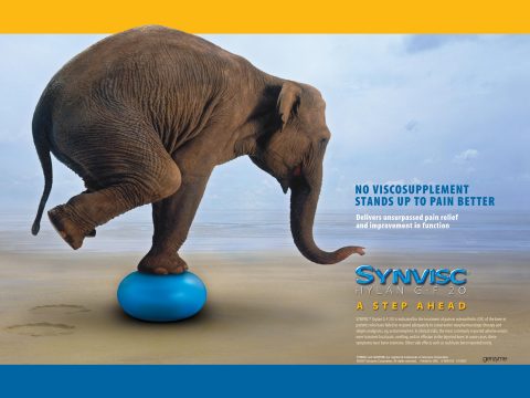
Synvisc was the leading brand in a crowded category of viscosupplements—products that are injected into the knee to relieve the pain of osteoarthritis. However, Synvisc was continuing to lose market share, as there was broad parity in this category in terms of clinically demonstrated efficacy, with most of the products perceived to work more‐or‐less the same. It was strategically determined that, in order to drive further differentiation and growth, the Synvisc brand needed to heighten its efficacy perception. But how could this be achieved in the absence of actual data?

The now‐classic “Elephant” campaign was conceived to answer this challenge. A dramatic and memorable “product demonstration” was at the heart of the campaign—a massive elephant being supported by the Synvisc brand icon (blue gel ball). Needless to say, this image conveyed strength under pressure—literally. What’s more, a skillfully crafted headline created an impression of strength and superiority, even though it was only making a legally non‐inferiority claim.

The “Elephant” campaign became the core of the Synvisc promotional campaign, and it appeared in every medium. Physicians responded favorably, driving Synvisc prescriptions significantly higher during the 3 years of the campaign. For the Synvisc brand, the “Elephant” campaign became a milestone of success—success driven by some very smart advertising.

Any awards and honors received:
Multiple RX Club Awards
MM&M Silver Award
PM360 Readers Choice Award
Actos

Actos

Name of Company: Takeda Pharmaceuticals
Agency which created Ad: AbelsonTaylor
Agency submitting: AbelsonTaylor
Creative Rationale:

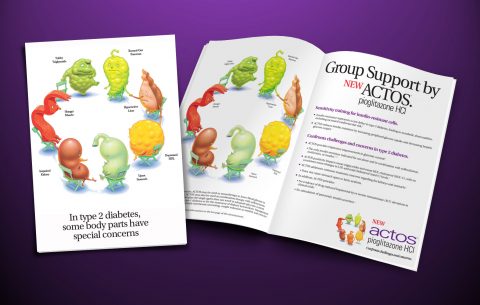
In 1999 Takeda Pharmaceuticals had the opportunity to launch a new TZD product for type 2 diabetes. But, we were third to market. Parke Davis’ Rezulin, the innovator, was well liked by endocrinologists but had a very clear, albeit infrequent, incidence of liver cancer. GSK launched Avandia, a new TZD without the liver cancer issue. In truth, there were few clinical differences between Avandia and Actos. Our approach was to make the use of a TZD “friendlier” – the products had relatively few adverse reactions and good efficacy. We were determined to be the friendlier brand to the mass of patients with T2D who were our opportunity… and to the primary care doctors who had not adopted Rezulin and now had a choice.

The creative solution was a friendly brand; it depicted the many organs affected by type 2 diabetes, including the Hungry Muscle, the Burned-Out Pancreas, the Upset Stomach, and many others. The headline said it all: “Group Support by Actos.” The decision to be friendly was broad-reaching: from whimsically drawn anthropomorphic organs, to the conscious decision to make the logo use a lower case “a” in “actos.” Firmly entrenched in the age of physician tchotchkes, Takeda and Lilly created and disseminated organ “Beanie Babies” and gummy candies. Reps and doctors alike loved the friendliness of the campaign, making it easy to embrace Actos.

Physician reaction was speedy and positive. Within a year, the GSK lead from Avandia was wiped out among endocrinologists, and the prescription lead overall was achieved within 3. The campaign was used by all but one Takeda affiliate worldwide, and was used universally by US and global marketing partner Eli Lilly.

Any awards and honors received:
One Rx Club aware award
Three In-Awe awards
One Aurora award
MAHF_HeritageAwards_Zomig.jpeg

Zomig

Name of Company: MedPointe Pharmaceuticals
Agency which created Ad: Wishbone
Agency submitting: Calcium
Creative Rationale:

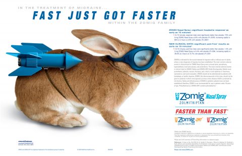
The Zomig “Bunny” creative campaign is among the most iconic and memorable of the last 20 years. It created a splash almost instantly for its verve, boldness, and, yes, its wit, which is a rare quality in pharma advertising. But, rather than simply being creative for creative’s sake, this campaign emanated out of strong insights into the brand, audience, and category. As a result, the campaign not only dramatically raised awareness of the brand and improved perceptions—it helped drive growth, too.

Zomig competed in a crowded and undifferentiated migraine market dominated by Imitrex and tablet formulations. At the time Wishbone won the account, Zomig had been on the market for several years, competing primarily with Imitrex, Maxalt, and Relpax, with limited success. The challenge was to meaningfully differentiate Zomig with our physician customers: neurologists and PCPs.

The brand was available in a variety of formulations: tablet, melt, and nasal spray. The strongest data was for the nasal spray formulation, specifically around speed of onset, which was equivalent to the injectable formulation of Imitrex. However, this was a single study, which created challenges to promotional usage. In addition, Imitrex tablets were 2 years away from patent expiration, so moving use of Zomig away from tablets to the other forms was imperative before the leading brand and leading formulation became available generically.

Our strategy was to leverage the speed of the nasal spray form across the franchise. Due to the regulatory limitations of speed claims, we knew a strong concept was particularly crucial. In essence, our core brand idea was “redefining speed”, which led us to the headline, “Fast just got faster”. Visually we took an icon of speed, the rabbit, and gave it a rocket pack! Both strategically and creatively, Zomig was now distinct and energized.

Any awards and honors received:
2005 MM&M Awards: Best Individual Product Advertisement in Business Press Winner
2005 RX Club Show: Silver Award for Spread Ad
2005 PMT Reader’s Choice Award
2005 In-Awe: Silver Award
Biaxin_clarithromycin

Biaxin

Name of Company: Abbott Pharmaceutical Products Division (now AbbVie)
Agency which created Ad: AbelsonTaylor
Agency submitting: AbelsonTaylor
Creative Rationale:

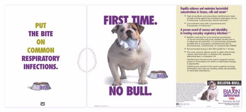
Physicians dread having patients return again and again to their offices due to antibiotic failure. What they want is an antibiotic that works. First Time. No Bull. And that’s the story of Biaxin. A powerful, broad-spectrum antibiotic that takes care of the problem the first time. To tell this story, AbelsonTaylor created Bix the Biaxin Bulldog. Bix symbolizes the tenacious efficacy of Biaxin while the copy tells physicians how to, “Put the bite on common respiratory infections.” Bix the Bulldog helped Biaxin become one of the most widely prescribed antibiotics on the market. The campaign crushed ad recognition and product recall norms. It also led to a 30% increase in sales calls for Biaxin by the Abbott sales force.

Any awards and honors received:
Med Ad News Ad of the Year 1996
In-Awe Gold 1998
Rx Club Gold 1999
Prevacid_Lansoprazole

Prevacid

Name of Company: TAP Pharmaceuticals (now Takeda Pharmaceuticals)
Agency which created Ad: AbelsonTaylor
Agency submitting: AbelsonTaylor
Creative Rationale:

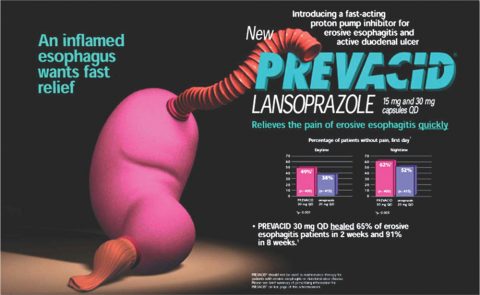
Remember when proton pump inhibitors were really dangerous? Like pre-cancerous cells dangerous? That was the state of the market when Prevacid launched in 1995. Physicians knew that PPIs were significantly better than H2RAs. But, at the same time, there was still concern about prescribing them, especially among primary care physicians. That’s where the Prevacid Tummy came in. Tummy represented a friendly, black-box-free PPI. The soft, puppet-like GI tract proved to be both approachable and endearing. No one wanted to see Tummy in pain. And the copy focused on what was important to patients and physicians, and that was symptom relief. Finally, Tummy proved an enduring symbol for Prevacid from launch, to OTC, and all the way through patent loss.

Any awards and honors received:
Med Ad News Ad of the Year 1995
In-Awe Gold 1996, 1997, 2000, 2003, and 2005
Global Award 1999 and 2003
PMT Reader’s Choice Gold 2003 and 2004
Benadryl_Ad

Benadryl Decongestant

Name of Company: Parke Davis
Agency which created Ad: Sudler & Hennessey, NY
Agency submitting: Sudler & Hennessey, NY
Creative/Account Team: Ernie Smith, Copywriter: Sandra Holtzman, Photography: Ken & Carl Fischer
Creative Rationale:

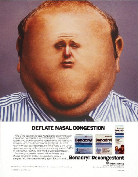
The image says it all—it presents the symptoms so perfectly that you start to feel stuffed up just looking at it. Then all you need is the perfect three-word headline to promise relief.

When the work communicates so clearly, there’s nothing more to say.

Tarceva

Tarceva

Name of Company: Genentech/Roche Pharmaceuticals
Agency which created Ad: AbelsonTaylor
Agency submitting: AbelsonTaylor
Creative Rationale:

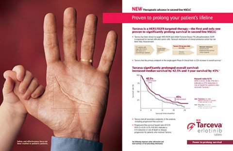
Our second campaign is the global launch campaign for Tarceva, developed for Genentech/Roche Pharmaceuticals. The campaign, launched in 2005, was designed to communicate two critical features of the brand. First, Tarceva offered a survival advantage in 2nd line NSCLC… something that only chemotherapy had proven to date. Second, because Tarceva was a tyrosine kinase inhibitor, not a chemotherapeutic agent, it offered the opportunity of more “living” for the patient. The patient did not experience the debilitating side effects of chemo. We communicated the survival advantage by putting the universal graph for survival, a Kaplan-Meyer curve, in the lifeline of the patient’s hand. We then added the ability to live life more normally, communicated by the child’s hand. Our customers, who knew that many times kids could not see chemo patients due to the potential for infection, immediately latched onto this campaign.

Bentyl

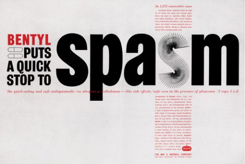
Bentyl/Lubalin Spasm

Name of Company: Merrell
Agency which created Ad: Sudler & Hennessey
Agency submitting: Sudler & Hennessey
Creative/Account Team: Copy: Don Clark; Art: Herb Lubalin; Photography: Carl Fischer
Creative Rationale:

At Sudler, we believe that type is an essential element of creative design.
This is the legacy of legendary Creative Director Herb Lubalin, who brought an extraordinary sense of graphic design and typography to all his work.

While Herb is known for the fonts Avant Garde and Lubalin Graph, here he uses a somewhat less well-known typeface, Slinky, to make SPASM not just a word, but also a demonstration.

Herb believed that we should let type talk, and in this ad, its message is loud and clear.

Hytrin

Hytrin

Name of Company: Abbott Laboratories
Agency which created Ad: AbelsonTaylor
Agency submitting: AbelsonTaylor
Creative/Account Team: Account: Dale Taylor/Jay Carter; Art Director: Stephen Neale; Copywriter: Jeff Chouinard
Creative Rationale:

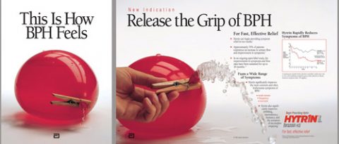
In 1993, when Abbott Pharmaceutical Products Division (now Abbvie) was preparing to launch an antihypertensive alpha blocker for a new indication for benign prostatic hyperplasia, they had a formidable competitor in Merck’s Proscar. Nonetheless, Hytrin had advantages of its own. Unlike Proscar, Hytrin worked rapidly to reduce the symptoms of BPH, as it had a different mechanism of action. Further, Proscar was just beginning to open up the marketplace for the disease. Physicians tended to delay treating the symptoms of BPH until there was substantial discomfort.
To address this, Abelson Taylor created the “Red Balloon” campaign, which simultaneously focused upon the symptom (personified by an overfilled water balloon) and the symptom relief (the hand, Hytrin, relieves the pressure of the prostate, the clothespin, on the bladder.) This ad was special… special enough that Hall of Famer Harry Sweeney wrote an article for Medical Marketing & Media’s “Ads I Wish I’d Done” feature to commemorate the campaign. Special enough that Med Ad News created an “ad of the year” award for it.

Something little noted but of great importance was the early use of brand vocabulary in the campaign. Merck called BPH “benign prostatic hypertrophy,” because its mechanism of action was to shrink an enlarged gland. Abbott chose “benign prostatic hyperplasia” because the brand reduced the muscle tension of the prostate…for more rapid relief.

Any awards and honors received:
Med Ad News Ad of the Year
In-Awe Gold
Navane

Navane/Navane Fist Face

Name of Company: Roerig
Agency which created Ad: Sudler & Hennessey
Agency submitting: Sudler & Hennessey
Creative/Account Team: Copy: John Lally; Art: Mike Lyons
Creative Rationale:

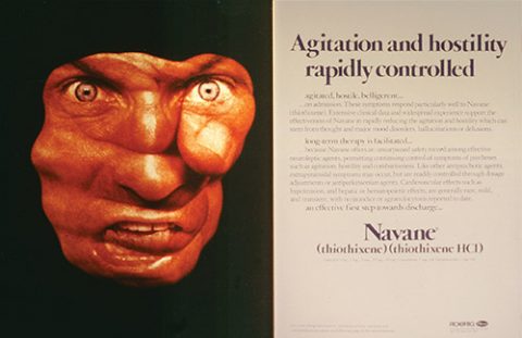
The Navane ad exemplifies the Sudler creative tenet of Indivisuality™ –the use of a unique visual idea to powerfully communicate a product story.

The arresting visual of the fist/face shows the immediacy of the threat posed by the agitated psychiatric patient – and the image is positioned looking out to directly confront the reading physician.

The urgent need for control is evident. And as soon as the reader looks for the answer, it’s there. The disturbing, out-of-control image is answered by the rapid control provided by Navane, presented in a simple, clean, all-type design. Clinical relief represented by visual relief.

Feldene

Feldene

Name of Company: Pfizer
Agency which created Ad: LLNS
Agency submitting: LLNS
Creative/Account Team: Mike Lyons – Art Director, Bill Brown – Copy
Creative Rationale:

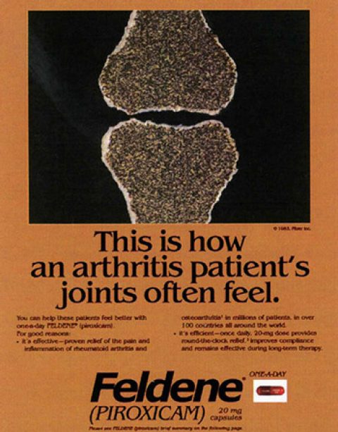
In 1983, copper bracelets for arthritis pain relief were widely used because people (even physicians) believed that copper was absorbed by the skin to relieve joint pain. LLNS used metallic copper ink in Feldene’s advertising to borrow from this widely held belief. The copper color extended beyond advertising to sample and trade packaging for Feldene, and was perceived as a very strong and consistent brand identity.The “sandpaper” texture of the bones in the ad was and extremely effective use of creativity to get the attention of physicians and to make Feldene interesting and relevant to them. In it’s day, this ad broke the mold because:

  • It had stopping power. By using copper metallic ink, the textured bones, and printing the ad on premium stock, we were able to “break the book” of many medical journals and create immediate interest.
  • The color and the texture fueled the memory and made this a highly recalled ad in many of the “check studies” that were regularly done by journals at that time.
  • Certainly, the ad generated interest, Feldene became a highly recognized and successful brand within a year of launch.
  • It set the stage for the brand experience, the metallic copper color and “sandpaper bones” became synonymous with the brand.
Any awards and honors received:
(LLNS says) While we’ve dug through our archives, we can’t find a list of awards for this ad, but we can assure you it won plenty!
Rocephin

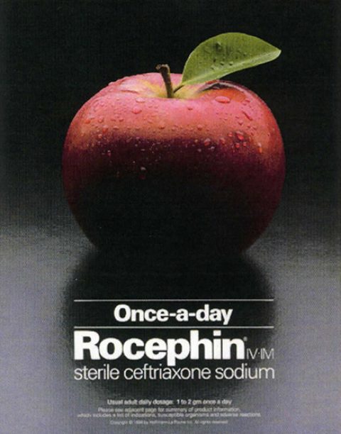
Rocephin

Name of Company: Roche Laboratories
Agency which created Ad: Sudler & Hennessey
Agency submitting: Sudler & Hennessey
Creative/Account Team: Copy: Diane Cooney, Diane Ohye, Brett Lowell, Laura Tozzo, and others Art: Arthur Kaufman, Dick Russinko, Guy Desimini, and others Account: Ned Putnam
Creative Rationale:

The Rocephin apple campaign is one of the most iconic brand campaigns in our industry. The image says it all – once–a-day for health. And amazingly, the campaign message remained vital for more than a decade, from its introduction in 1989 through the brand’s loss of exclusivity in 2005.

This campaign was unique in its ability to establish and remain true to a singular and powerful brand image, yet keep it fresh with new creative executions. It was also innovative in its promise, as the first parenteral hospital antibiotic to leverage once-daily dosing as a benefit – when conventional wisdom held that multiple daily doses were needed for serious infections.

Any awards and honors received:
Best Professional campaign, MANNY 2004
Rx Club Award of Excellence, 2004
Gold, MM&M Awards, 2004
…and others!