


MAHF Inductee
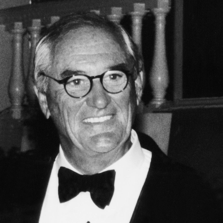
Jerry Philips

Jerry Philips
2004 Agency CreativeAs a teenager, Jerry Philips, showed artistic talent as a cartoonist. However, influenced by his family, his college education was in biology at NYU, where he earned a BS. In the army during WWII, he had a chance to develop his cartooning and eventually he turned to a career in art, attending Cooper Union, as have so many pharmaceutical industry art directors.
On entering the job market, he was hired by the Frohlich agency and then moved to another major Rx agency, McAdams, where he met John Kallir—the leader on the Roche account. They worked on Roche’s broad product line—Romilar, Noludar, and Gantricin, for example—and eventually on the mega-brand Librium. Kallir left McAdams and, after a brief interval, asked Philips and Warren Ross, who had also been at McAdams, to join him to form Kallir Philips Ross (now KPR) in 1961.
The three were a classic agency partnership with a strong creative orientation: Kallir, a copywriter, who had taken on a management role; Ross, an account person, but with a writing background; and Philips providing the art and design resource. The agency grew to become one of the leading US pharmaceutical advertising agencies.
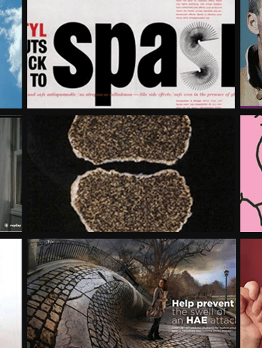
Philips art direction was central to 3 of the agencies signature campaigns. Warren Ross describes the program that built McNeil’s Tylenol from a minor, pediatric fever drug into the non-Rx, analgesic leader: “The headline was, ‘Tylenol or aspirin? Which analgesic for the patient with…’ followed by a specific indication. Jerry did an all-type ad, which was very unusual, and most people would say, ‘That’s the most boring thing in the world.’ It set the stage for the medical approach to promoting Tylenol and that was the key.”
Philips had understood that reasoned argumentation for Tylenol, an appeal to MDs’ thoughtfulness about the side effects of aspirin in specific conditions, needed a soft sell. The campaign ran for years and slowly built Tylenol into an astounding marketing success based on MD recommendations.
As low key as was the Tylenol program, the Haldol campaign used a contemporary design approach by which Philips created a visual that would stress Haldol’s effectiveness and its patient benefit. Haldol is a tranquilizer suitable for patients with major psychiatric conditions.
John Kallir recalls the icon Philips created for the McNeil product: “Jerry, of course, participated in all the conferences on Haldol, and out of this talking to investigators and marketing people, he developed the launch ad that consisted of a series, sort of a square array of images, of a face that you can’t recognize at first. It gradually becomes a face. It’s blurred and fragmentary and then gradually the face appears. And that symbolized the reintegration of the personality.”
The progression of the patients from their troubled mental states had been clearly presented with the message that Haldol would enhance the treatment process. Once again Philips had caught the product’s essence and used graphics to state the drug’s promise.
Lastly, the product graphic for Upjohn’s Motrin was an example of Philips’ creative range. In the introductory campaign, the identifying visual was the bones of a knee rendered in white Styrofoam seen up close with rays of light bursting from the joint to represent the inflammation of arthritis. The product icon quickly communicated the pain and discomfort of the condition. Motrin became the benchmark NSAID and a success story for KPR.
Philips created hundreds of promotional programs over the years. Worthy of note is his lighthearted campaign for McNeil’s muscle relaxant Parafon 40 that speaks to his cartoonist inclination; it was one of the first major programs KPR did for McNeil. The visuals in the long-running campaign were photos of persons with limited mobility who, thanks to Parafon 40, gained freedom of motion. The creative spark was in the humor of the before-and-after situations—an unhappy track official unable start a race and then, smiling, his arm raised firing his pistol, or a man unable to turn toward an attractive woman and then free to watch her go by. All those who recall Philips’ work remark on his ability to apply his impressive artistic talent to the promotional situation.
Says Ross, “He was a great art director…perhaps unique [with] a great understanding of the message that the advertising was trying to communicate. He didn’t look for visualization to swipe, or what’s now being done on computer…if there was a word in the headline [and] whether there was a picture of that. He dug into the context and came up with layouts and conceptual visualizations that reinforced the message.”
Further, on Philips ability and his place in medical advertising, Frank Hughes has this perspective: “When you look at Jerry’s book today, it looks as modern as it did when it was created half a century ago. And that’s astonishing. I think he was one of the central figures in art direction of that time. The thing that is so extraordinary about all those art directors [in] a golden age of art direction was that what they did in medical advertising influenced consumer advertising. The work that was done in the 1950s and 1960s was so good that it has never been surpassed, and Jerry was in the vanguard of all that. His work, each piece, is something to look at and learn from.”
MAHF Inductee List
Select Years Inducted
- 1997 (5)
- 1998 (5)
- 1999 (5)
- 2000 (5)
- 2001 (4)
- 2002 (4)
- 2003 (5)
- 2004 (5)
- 2005 (5)
- 2006 (4)
- 2007 (3)
- 2008 (5)
- 2009 (4)
- 2010 (3)
- 2011 (3)
- 2012 (3)
- 2013 (3)
- 2014 (4)
- 2015 (2)
- 2016 (3)
- 2017 (2)
- 2018 (1)
- 2019 (2)
- 2020 (3)
- 2021 (3)
- 2022 (1)
- 2023 (2)
- 2024 (2)
- 2025 (2)
- 2026 (2)


Additional Content
Connect With Us
Interested in learning more about the Medical Advertising Hall of Fame, its goals and activities, membership or events?
We are happy to help!